Window Colours & Finishes
What Goes With Surfmist Window Frames: Walls, Brick, Cladding & Front Doors
By Sheng Xu · 30 September 2026
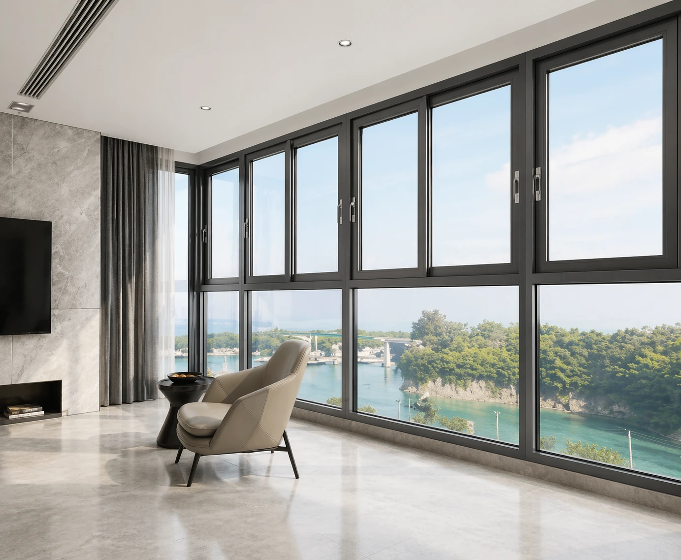
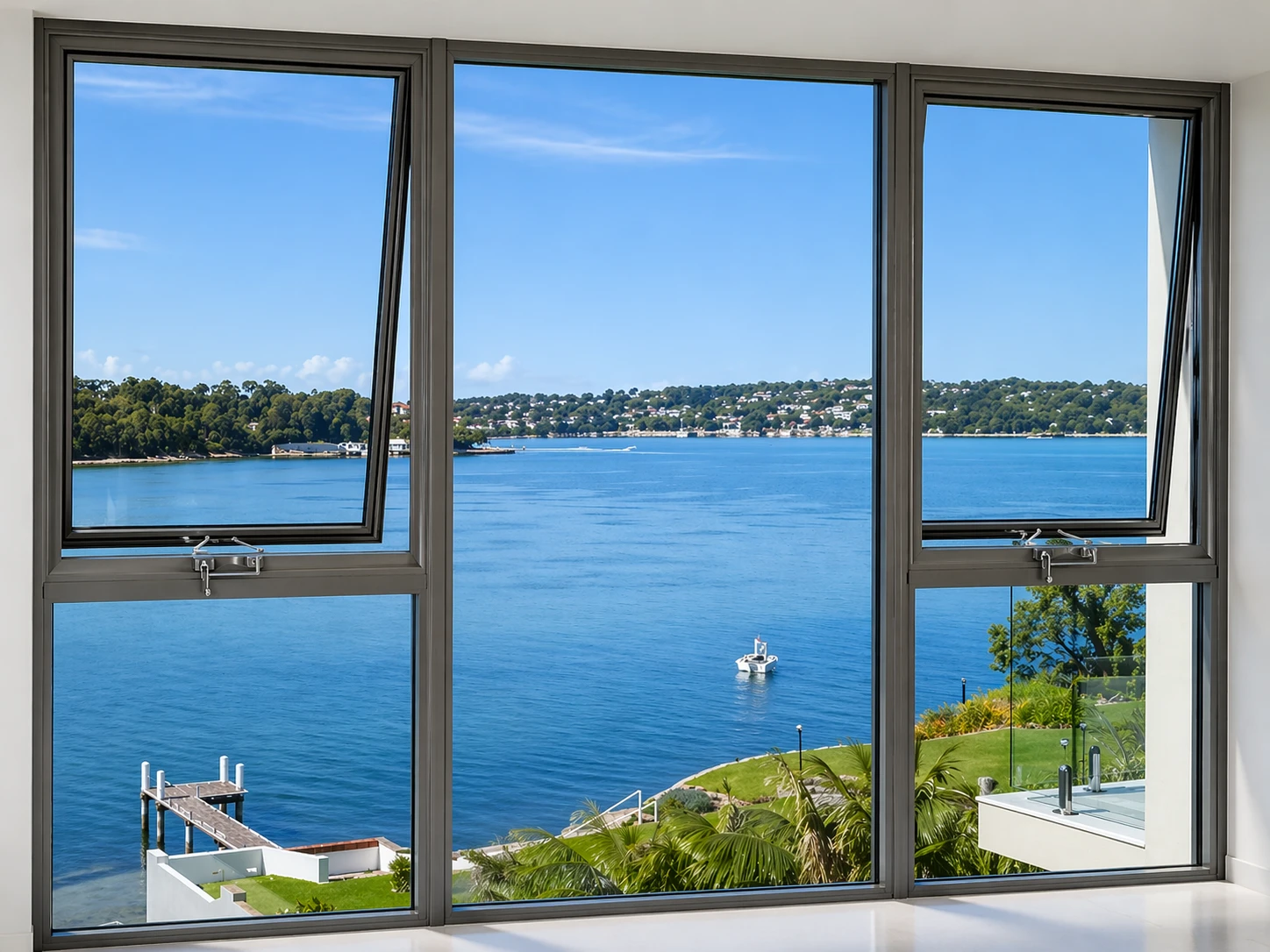
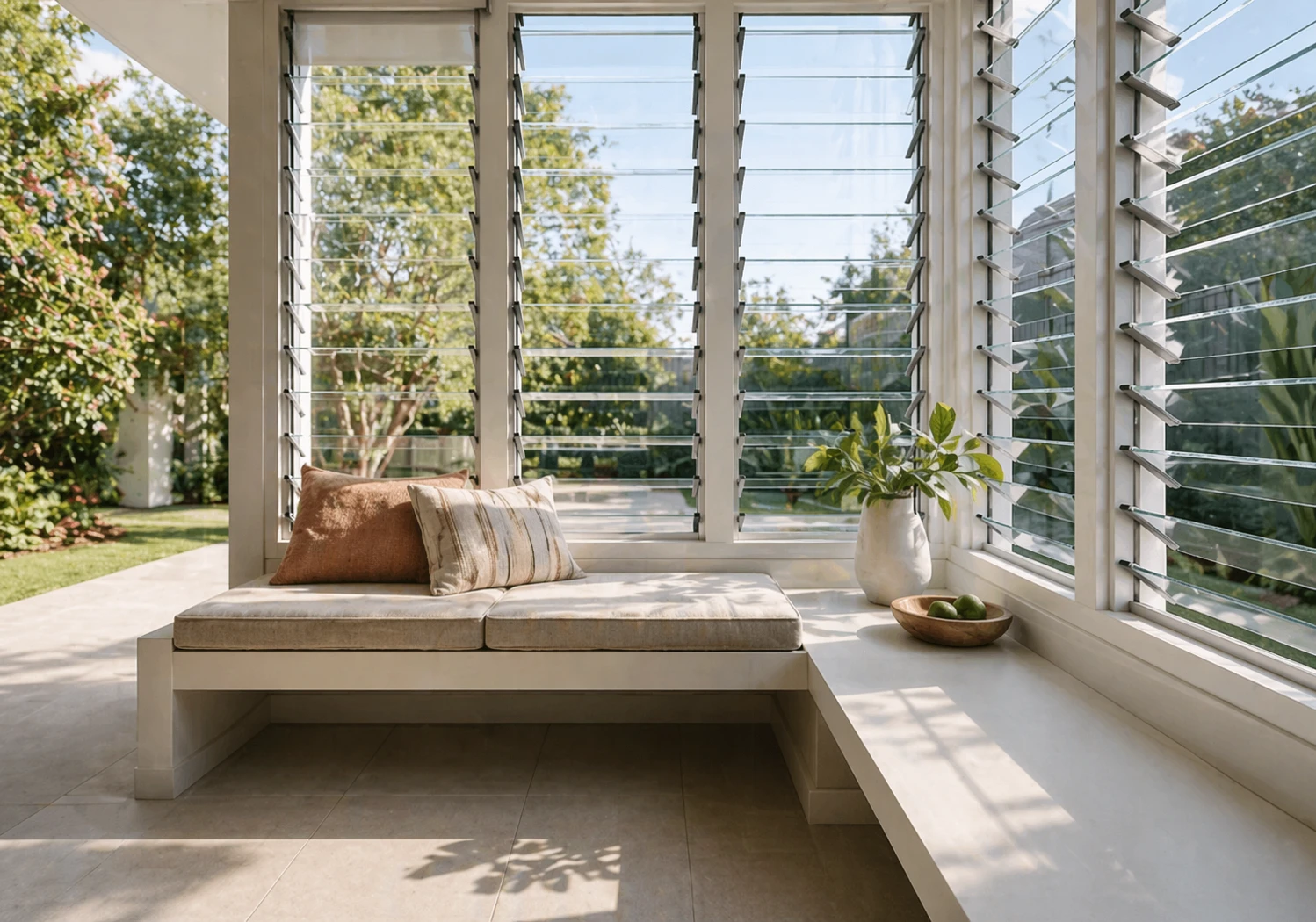
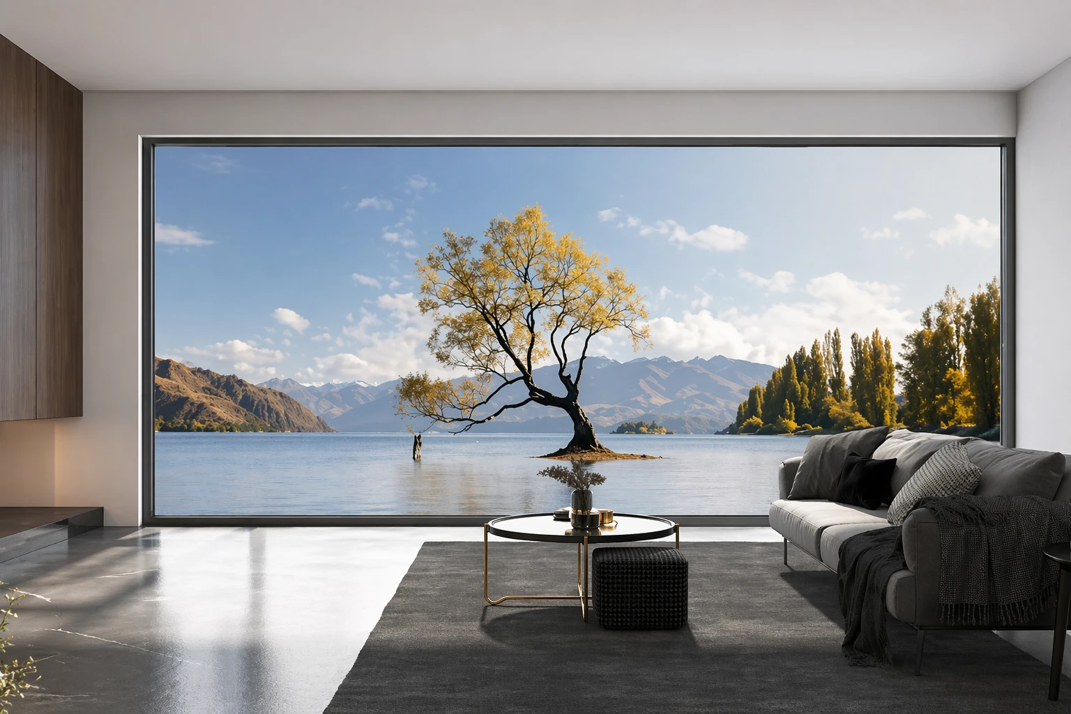
AI-generated illustrative image. Not a product test, certification record or project evidence.
Surfmist window frames pair best with warm greys (like Shale Grey or Dune), soft off-white weatherboards, greige render, earthy red or blonde bricks, and natural stained timber front doors. Because Surfmist is a soft, warm off-white (Colorbond HEX #E4E2D5) rather than a stark commercial white, avoid ultra-cool icy whites on adjacent cladding to prevent the joinery from appearing creamy or dull. Stained hardwood doors and deeper trims provide ideal contrast.
When deciding what colour goes with Surfmist window frames, the most successful Australian exterior palettes pair them with warm greys, soft natural off-whites, greige render, earthy red or blonde brickwork, and rich stained timber entrance doors. Surfmist is a soft, warm off-white rather than an icy commercial white, making it remarkably versatile across modern coastal, Hamptons, and contemporary suburban facades. Because architectural aluminium window frames are finished in a durable, permanent powder coat that cannot easily be repainted, choosing the right surrounding wall materials, masonry, and accent tones from the outset ensures your entire exterior looks unified, deliberate, and timeless.
The secret to coordinating an exterior colour scheme around Surfmist aluminium windows lies in managing undertones and tonal contrast. If wall colours are chosen without understanding the subtle warmth of the window coating, frames can inadvertently read as dingy beside stark whites, or look washed out against pale, cool greys. By deliberately matching or contrasting your cladding, brickwork, render, and front door, you can create a balanced facade where your window joinery cleanly anchors the building.
Understanding How Surfmist Reads on Aluminium Window Joinery
To build an exterior palette around Surfmist window frames, you must first understand what the colour actually looks like when applied to architectural aluminium. On BlueScope Colorbond steel sheets, Surfmist is catalogued with nominal colour coordinates of Hex E4E2D5 and RGB values of 228, 226, and 213, carrying a published solar absorptance of 0.33 and a Solar Reflectance Index of 81. In paint formulas, such as Dulux Colorbond Surfmist, the colour is specified at Hex d7d6cb with an RGB of 215, 214, and 203, alongside a light reflectance value of 70. However, on residential window frames, Surfmist is applied as a specialised thermoset architectural powder coat formulated to visually match the Colorbond steel shade, rather than being steel or liquid paint itself.
In Australian natural daylight, Surfmist powder coat reads as a soft, muted off-white with a gentle undertone that sits between warm cream and subtle grey-green. Unlike pure brilliant white or clinical traffic white, Surfmist lacks harsh blue pigments. This warmth allows it to blend comfortably into the Australian landscape, reflecting intense summer sun without throwing off blinding glare. When viewed from the street against darker cladding or brick, Surfmist windows read distinctly as fresh white joinery. However, if placed directly adjacent to a stark, optical white surface, the underlying warmth becomes immediately apparent.
Another vital practical reality of residential window joinery is that standard powder-coated aluminium frames carry the exact same colour on both the exterior and interior faces. While dual-colour extrusion systems exist, standard residential installations present Surfmist joinery to your internal living spaces, bedrooms, and kitchens. This means the exterior colour scheme you select must also sit comfortably alongside the internal wall paint, timber flooring, and architraves visible around your window reveals.
Pairing Surfmist Windows With Cladding and Weatherboards
Timber weatherboards and modern fibre cement horizontal cladding remain among the most popular wall claddings for Australian homes featuring Surfmist windows. The primary challenge when specifying cladding colours is deciding whether your windows should softly blend into the wall surface or stand out as a crisp architectural frame.
If you prefer a cohesive, low-contrast coastal or Hamptons elevation, warm off-white and soft neutral cladding is an exceptional choice. Painting weatherboards in a warm white such as Dulux Natural White, Dulux Whisper White, or an exterior paint tinted directly to Colorbond Surfmist creates a seamless, breezy facade. The danger in this category arises when builders or homeowners pair Surfmist frames with ultra-crisp, cool-toned white cladding, such as Dulux Vivid White or Lexicon Half. Against these cool, blue-based whites, Surfmist frames will instantly appear slightly beige, dull, or yellowish by comparison. If you want a white-on-white exterior, keep your cladding paint within the warm or neutral white families so the undertones harmonise.
Light grey cladding is another wildly popular selection, but it requires careful tonal management. Homeowners frequently pair Surfmist windows with pale grey weatherboards, such as Colorbond Shale Grey or Dulux Silkwort. When executing this combination, be aware that pairing pale grey cladding with a Surfmist roof and Surfmist windows can occasionally result in what exterior designers refer to as a washed-out cloud facade, where the building lacks depth and definition. To make light grey weatherboards succeed with Surfmist window frames, introduce contrasting elements such as natural hardwood decking, a distinctive front door, or darker fascia and gutters to give the elevation visual weight.
For contemporary and architectural new builds, deep cladding colours create a dramatic, modern contrast against Surfmist joinery. Specifying dark charcoal cladding, such as Colorbond Monument, Basalt, or deep charcoal vertical groove panels, allows pale Surfmist window frames to pop as a clean geometric outline. This reverse-contrast approach softens the heavy industrial aesthetic of all-dark homes while brightening internal views from within.
Complementing Brick Facades With Surfmist Frames
Selecting window frame colours for brick homes can feel daunting because masonry is a permanent, textured natural material that cannot be repainted. Surfmist aluminium windows perform exceptionally well across several distinct Australian brick palettes, provided you respect the undertones within the clay.
Traditional red and terracotta brickwork pairs remarkably well with Surfmist window joinery. Red clay bricks have an inherent warmth and earthiness that clashes aggressively with stark, clinical white window frames. Brilliant white joinery against red brick often looks harsh, cheap, or overly stark. Surfmist, by contrast, possesses just enough warmth and grey softness to frame red and terracotta brickwork with timeless dignity. The off-white frames lift the facade and brighten the overall elevation without creating jarring visual friction against the brick joints and off-white mortar.
Blonde, sand, and cream-toned brick homes achieve a serene, organic aesthetic when paired with Surfmist window frames. Light textured bricks reflect abundant sunshine, and Surfmist joinery integrates seamlessly into the pale masonry palette. This combination is especially effective for single-storey suburban homes and coastal acreage properties surrounded by native gum trees, blonde grasses, and sandstone retaining walls. Because there is minimal contrast between the brick and the window frames, the facade feels relaxed, spacious, and grounded.
Dark charcoal, espresso, and chocolate brick facades present a different design choice. In contemporary architectural design, many builders instinctively specify dark Monument or black window frames to blend directly into dark brickwork. However, installing Surfmist window frames into dark brown or charcoal brick creates a sharp, graphic contrast. If you choose Surfmist frames for dark brick, ensure that other facade elements, such as light rendered piers, pale front gables, or light entrance features, repeat the off-white tone so the windows do not look isolated.
Render Finishes and Masonry Colour Schemes
Rendered masonry walls provide a smooth, uniform surface that showcases the clean lines of aluminium window joinery. Because render paint formulas can be customized precisely, you have immense freedom when pairing rendered walls with Surfmist frames.
Greige and warm earthy render tones offer one of the most reliable and sophisticated pairings for Surfmist joinery. Earthy neutrals inspired by Colorbond Dune, Paperbark, or Gully sit naturally alongside Surfmist frames. Colorbond Dune render, with its balanced blend of warm grey and subtle stone undertones, complements the softness of Surfmist without competing with it. The slight tonal difference between a Dune rendered wall and a Surfmist window sash gives just enough shadow and depth to highlight the window openings without looking busy.
When choosing neutral grey render, always test whether the paint formula leans warm or cool. Warm greys containing yellow, green, or umber pigments sit comfortably against Surfmist frames. Cool greys dominated by blue or violet undertones can cause Surfmist to look slightly yellowish or dingy under direct sunlight. If you want a modern grey render, select greys that share Surfmist's neutral-to-warm foundation, such as Dulux Pipe Grey, Miller Mood, or Stepney.
Using contrasting render finishes on split-facade homes is an effective way to balance Surfmist windows. For example, rendering the ground floor in a grounded mid-tone grey or warm stone finish while finishing the upper floor in light cladding creates an attractive two-tone composition. In this setting, Surfmist window frames tie both levels together into a single cohesive architectural envelope.
Selecting Front Door Colours to Anchor the Facade
The front entrance door is the primary focal point of any residential elevation. Because window joinery is distributed across the entire facade, the front door represents your best opportunity to introduce rich colour, warmth, and personality without upsetting the broader exterior palette.
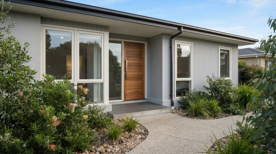
Natural stained timber front doors are widely considered the gold standard for Australian homes featuring Surfmist window frames. Species such as Blackbutt, Spotted Gum, Tasmanian Oak, and Western Red Cedar introduce an authentic organic warmth that prevents neutral, white, or grey facades from feeling sterile. The amber and honey tones of natural timber complement the soft warmth of Surfmist joinery effortlessly. Pairing a substantial stained timber pivot door with Surfmist window frames and pale weatherboards immediately establishes a premium, welcoming coastal aesthetic.
Bold painted front doors offer a stylish and easily updated way to inject vibrant character into your entry. Deep nautical blues, such as navy or midnight blue, create a sophisticated coastal focal point that contrasts sharply with Surfmist windows and pale cladding. For homes embracing a relaxed beachside character, vibrant turquoise, coastal teal, or sage green front doors echo the native coastal landscape. Because a painted front door represents a small, contained architectural surface, you can experiment with expressive colour while trusting your Surfmist window frames and neutral walls to maintain overall harmony.
Dark architectural doors in Colorbond Monument or deep charcoal provide a crisp, modern anchor for contemporary facades. A dark entrance door ties cleanly into darker rooflines, charcoal gutters, or black external light fixtures, creating a purposeful visual hierarchy. Alternatively, finishing the front door in matching Surfmist creates a minimalist, low-key entryway that suits minimalist coastal and modern cottage elevations.
Viewing Samples and Accounting for Substrate Variations
One of the most common mistakes in exterior design is choosing paint colours and window finishes indoors under artificial showroom lighting or from tiny printed swatches. Colours perform drastically differently under the intense clarity of the Australian sun than they do inside a design studio.
Always obtain physical powder-coated aluminium colour swatches from your window manufacturer and inspect them directly on site alongside your proposed cladding, render samples, and brick options. View the materials outdoors at different times of day, including harsh midday sun, soft morning light, and shaded late afternoon conditions. Observe how the reflection changes across different substrates. The smooth, semi-gloss or satin surface of a powder-coated aluminium window extrusion reflects light differently than rough cement render, porous face brick, or textured painted timber weatherboards, even when painted in an ostensibly matching Colorbond shade.
Remember also to inspect your window swatches against your proposed interior finishes. Because standard aluminium windows feature the same powder-coat colour inside, examine how Surfmist looks against your planned internal wall paint, architrave trims, and timber flooring. Surfmist joinery pairs beautifully with warm interior whites like Dulux Natural White or Casper White Quarter, but can clash with ultra-cool white internal paints.
Frequently Asked Questions
Can you use Surfmist window frames with a red brick house?
Yes, Surfmist window frames work exceptionally well on red and terracotta brick homes. Unlike stark, clinical white frames that create a harsh and dated contrast against rich red clay, Surfmist provides a soft, warm off-white border that complements the natural earthiness of traditional brickwork. It brightens the elevation while maintaining architectural harmony with warm mortar joints.
What shade of grey cladding looks best with Surfmist windows?
Warm greys and balanced mid-tone greys pair best with Surfmist windows. Colours like Colorbond Shale Grey, Dulux Silkwort, and soft greige tones like Colorbond Dune provide an attractive backdrop that allows Surfmist joinery to read cleanly as white. Avoid overly pale, icy greys with heavy blue undertones, which can wash out the facade or cause the subtle warmth of Surfmist to look dull.
Will Surfmist window frames look yellow or dirty against white weatherboards?
Surfmist frames will only look yellow or dirty if paired with ultra-stark, cool-toned white cladding like Dulux Vivid White or Lexicon Half. When placed against a stark white containing blue pigments, Surfmist's warm undertone becomes exaggerated. To prevent this, paint white weatherboards in a warm or neutral white, or paint them in a direct Colorbond Surfmist exterior paint match.
Should your front door match your Surfmist window frames?
Your front door does not need to match your window frames. While a matching Surfmist front door creates a neat, minimalist entry, most Australian architects and colour consultants recommend introducing a stained natural timber door or a bold accent colour like navy blue, sage green, or charcoal. A contrasting entrance door adds warmth, creates a clear focal point, and elevates the street appeal of the home.
Summary Checklist for Your Exterior Colour Palette
Coordinating an exterior colour scheme around Surfmist window frames comes down to respecting the subtle warmth of the powder-coat finish. Pair Surfmist joinery with warm whites, mid-tone greys, earthy render, traditional or blonde bricks, and rich timber accents. Avoid stark, icy blue-whites that fight the coating's undertones, and balance light cladding with grounded textures or deeper roofing trims.
At SMIRO, our architectural aluminium window and sliding door systems are manufactured to rigorous Australian standards and available in an extensive range of durable architectural powder-coat finishes, including Colorbond-matched Surfmist. Because window joinery is a permanent investment, we always recommend ordering physical aluminium colour swatches to test alongside your building materials on site before finalising your order.